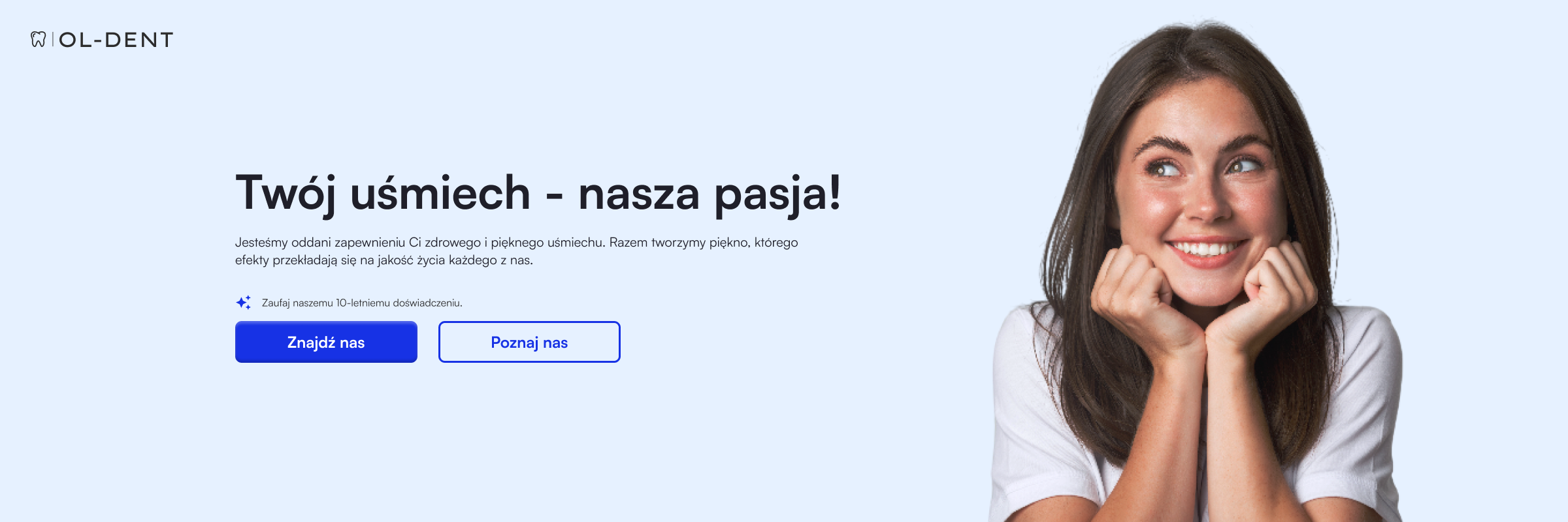
OL-DENT
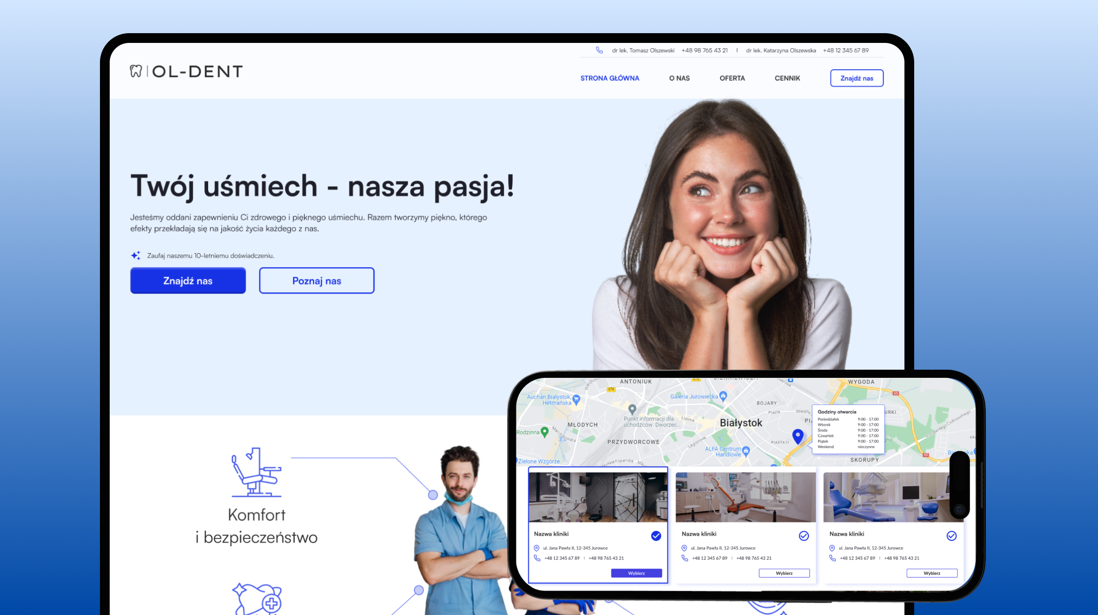


I was asked to design a business card website for a dental practice - on the initiative of the owners' son, who was to handle the implementation, but needed help with aesthetics and structure. My task was to create a clear, professional UX/UI interface tailored to the needs of patients.
The design has been prepared for implementation, but is not yet published.
The clients (Ol-Dent dentists) work in different facilities, take private appointments at home, and offer walk-in visits. The lack of a single place with up-to-date information makes it difficult for patients to contact and sign up for appointments - they don't know where and when they can receive services
Create a simple and clear website that will be the central place of contact - with information about available facilities, forms of admission and details of dentists.
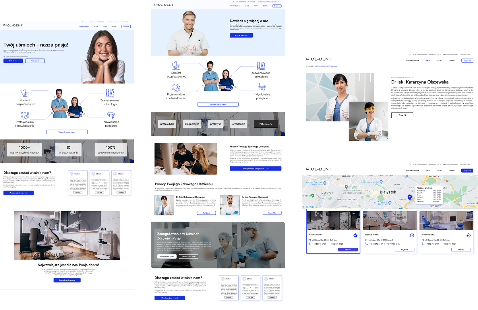
Design a unified website that acts as a business card, bringing together in one place the most important information: description of services, locations of admissions, contact information and patient reviews.
With the new site, patients gain a single, trusted source of information - they can quickly see where a particular dentist is currently accepting appointments, in what format and how to make an appointment. The clear structure and clear layout of content reduce the barrier to contact, especially for older users. The site acts as a digital business card, which builds a professional image and makes it easier to establish relationships with new patients.
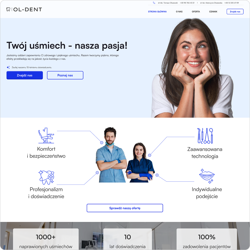

I analyzed the websites of other dental practices, focusing on their structure, communication style and content layouts. I also took into account the customer expectations outlined below. I defined the target audience and outlined the implementation concept.

Current and potential dental patients - people looking for proven dental care, who want to quickly find information about the location and form of admissions, and make direct contact.
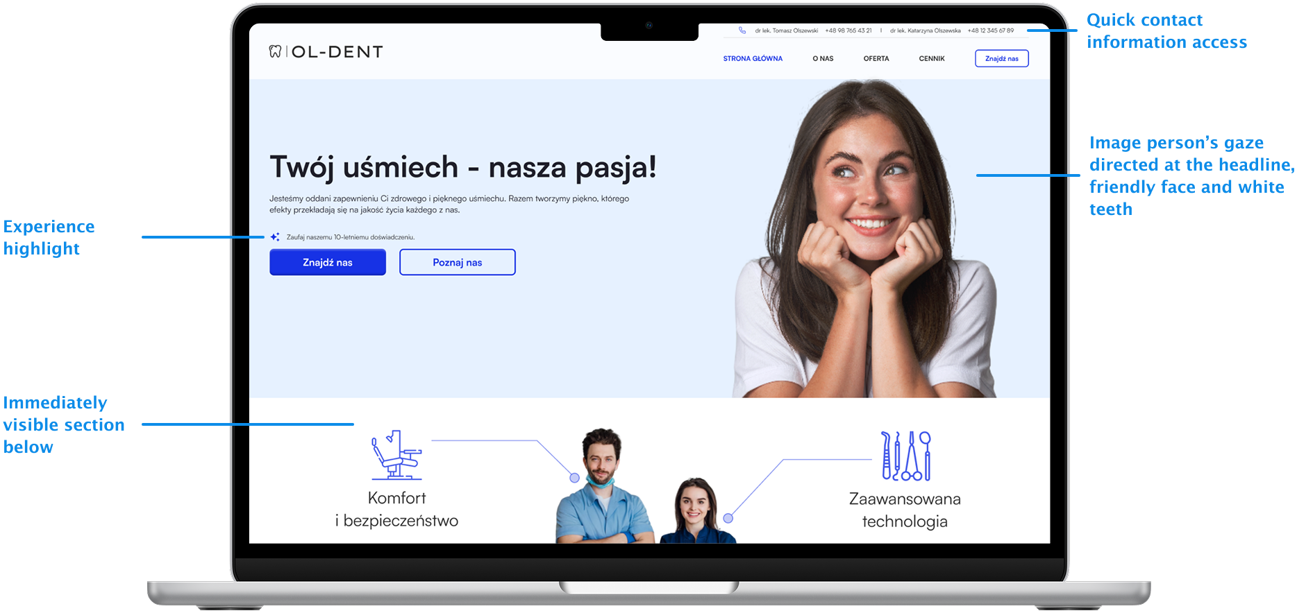
Dentists expected a simple website, accessible from any device, which:◦ provide quick access to contact information,◦ will clearly present the locations where they accept,◦ includes brief descriptions of the services offered,◦ will allow patients to get to know the doctors by briefly presenting their profiles,◦ will encourage new potential patients to make an appointment.
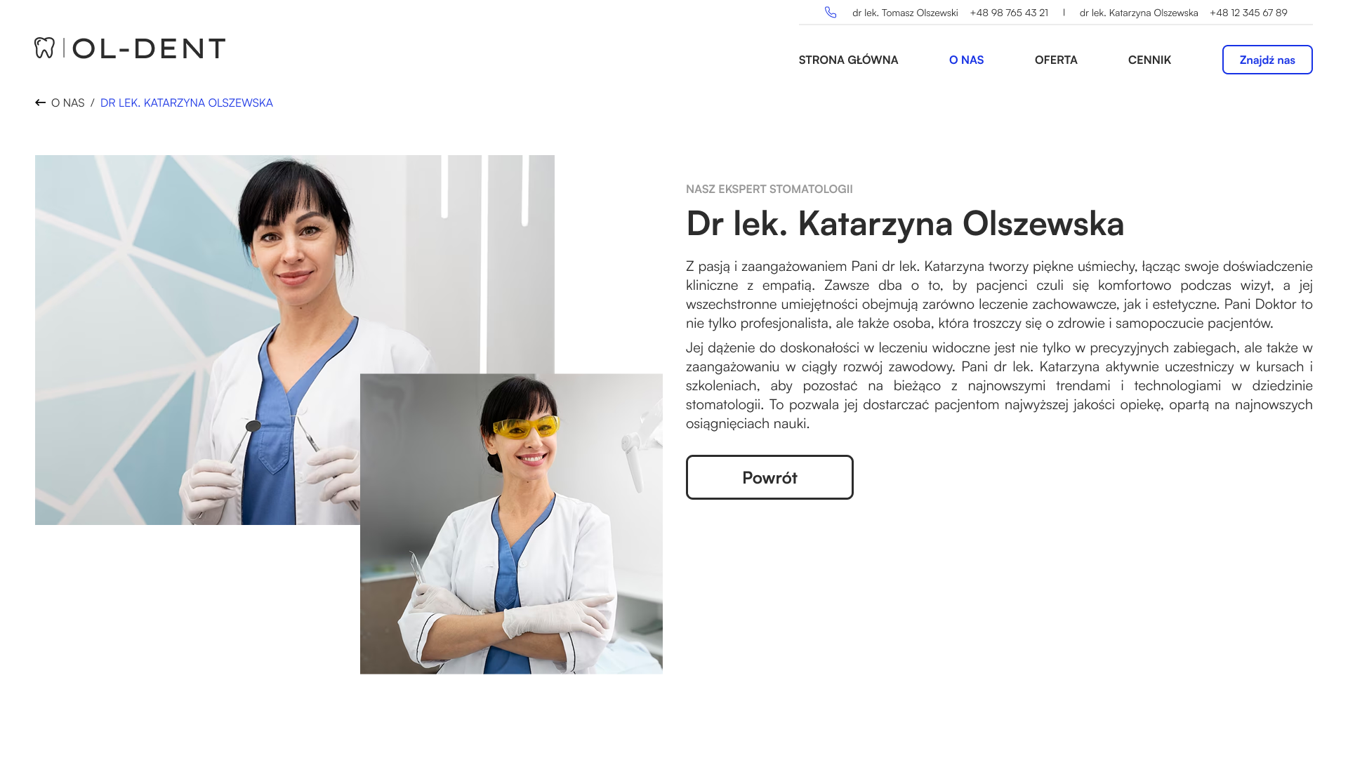
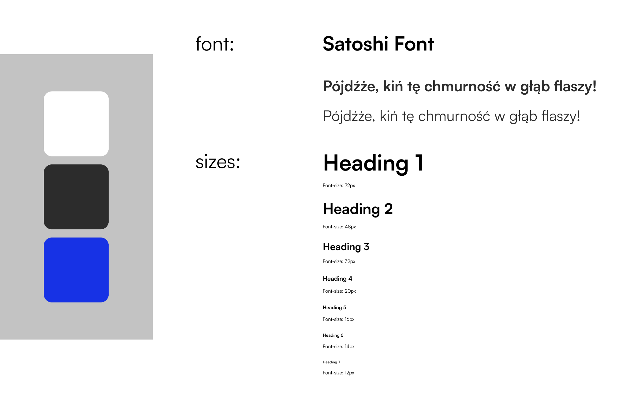
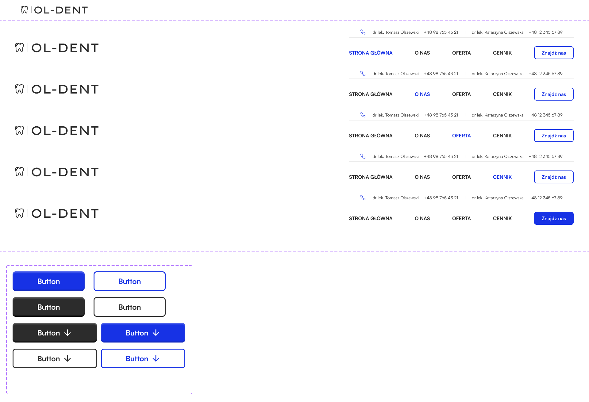
First, I developed a basic site map, corresponding to typical user paths. Then I created a lightweight components library: I specified typography, color scheme (subdued, confidence-inspiring) and basic interface components.

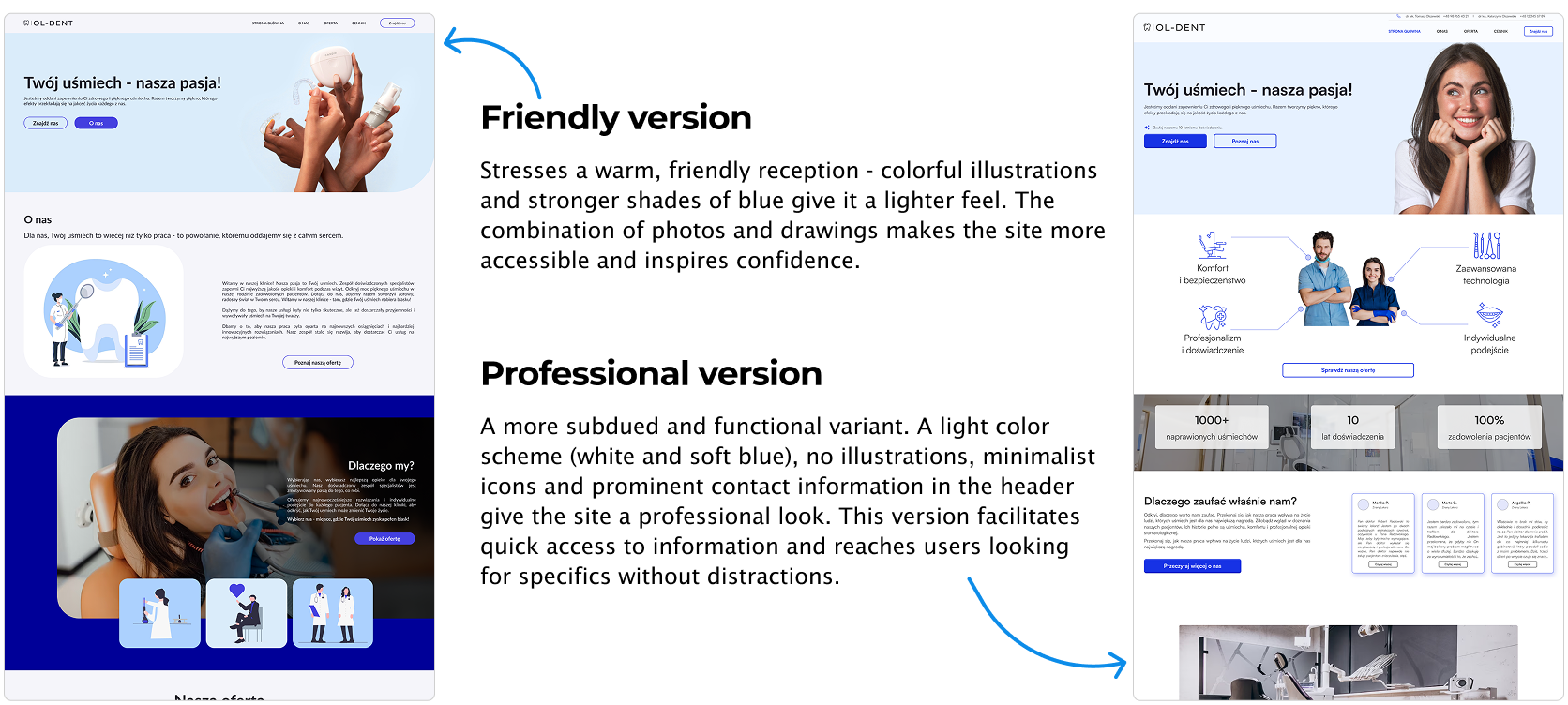
Prototypes
Initially, I designed the locations of the clinics only on the home page in the form of tabs, from which one would navigate to the details of the selected location.
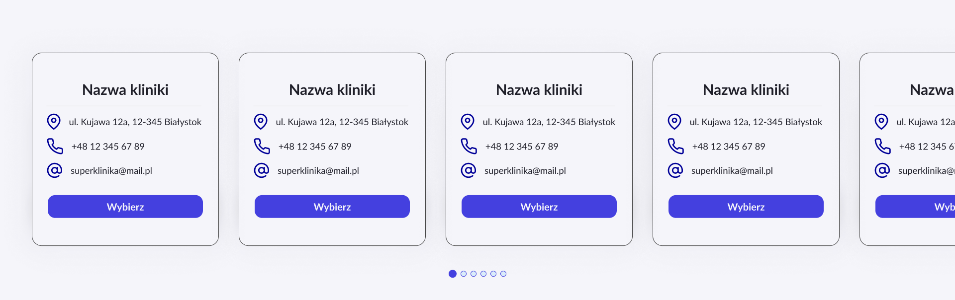
Suggested location details implementations:

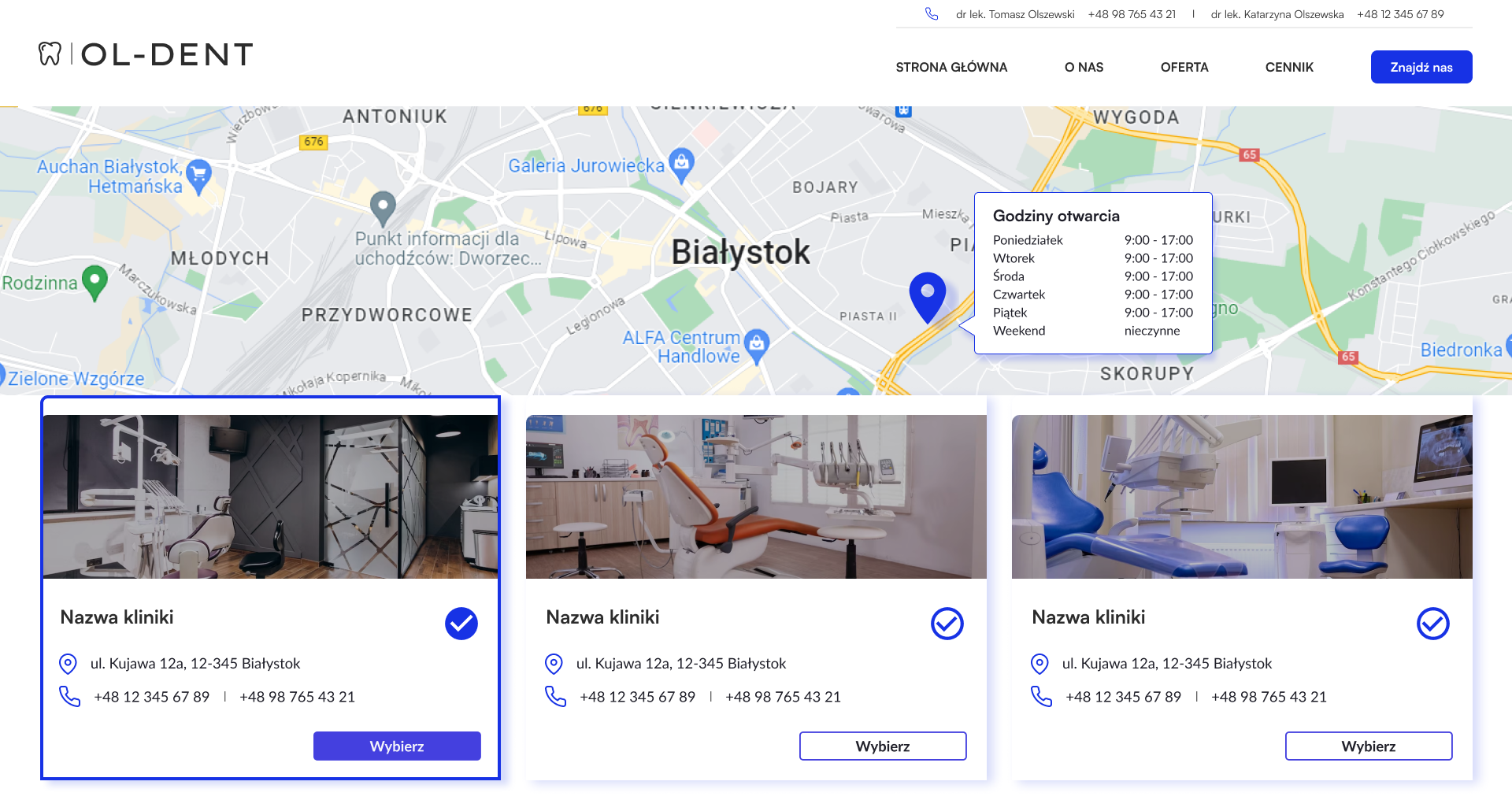
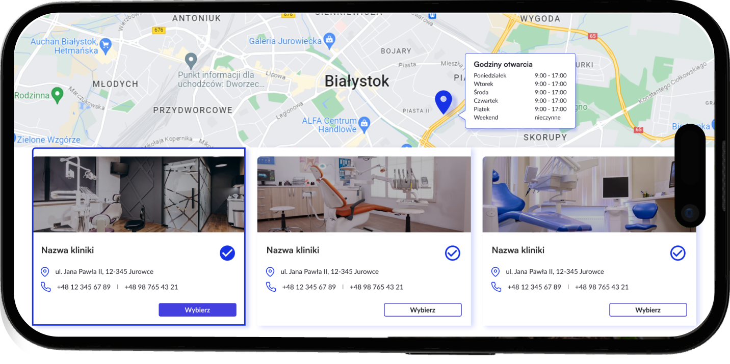
In the end, I devoted a separate tab to locations, so that all locations could be in one place. Users can now easily compare them thanks to an interactive map.
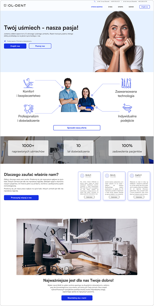

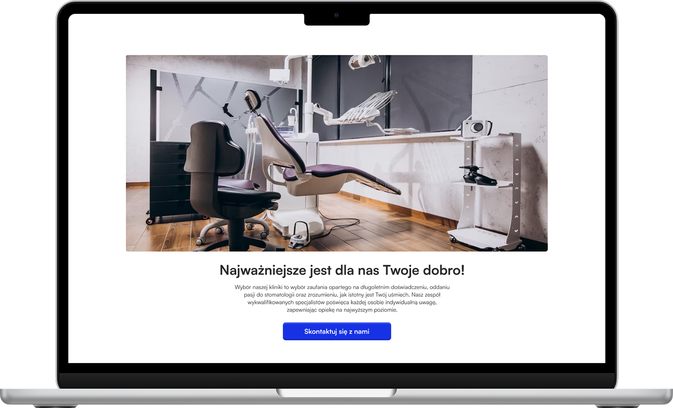
The biggest lesson? Design is not just about a "pretty" interface and UX, but also about responding to clearly defined goals and requirements - and it is the combination of these two aspects that produces the best results.
