
Steam
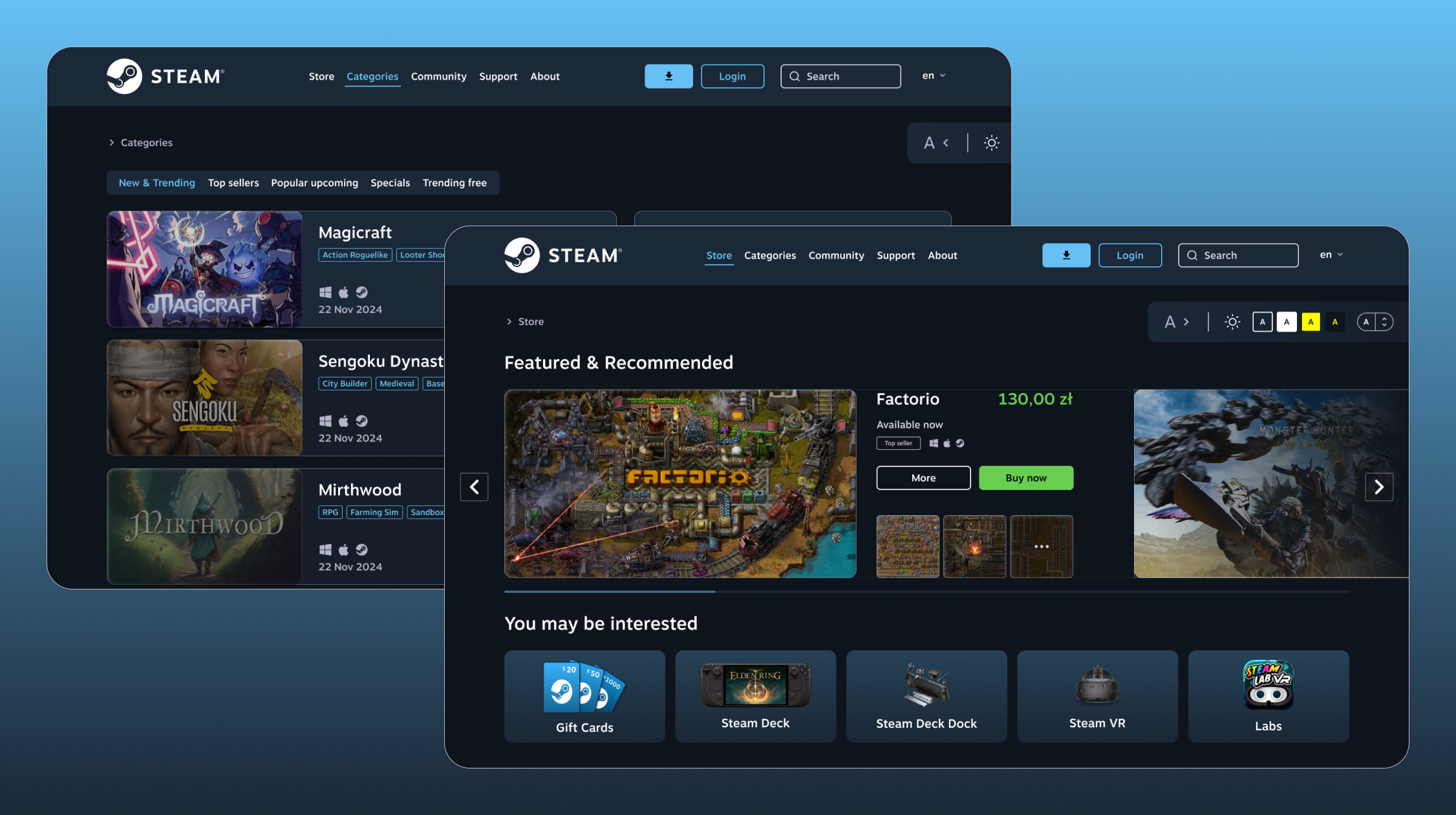


It is worth noting that the redesign concerns the appearance of the platform at the end of 2024.
The platform that my teammate and I chose to analyze and redesign was Steam, because it is one of the largest and most popular game distribution platforms, and at the same time has noticeable problems with accessibility and usability.
The aim of the project was to create an improved interface compliant with universal design principles and WCAG guidelines. The redesign was intended to improve accessibility for people with different needs (including people with disabilities), as well as to increase the intuitiveness and comfort of using the platform.
The research was conducted using Wave (for accessibility assessment), SUS surveys (usability), and an eye tracker (user attention tracking). Based on this, five key views were designed (home page, login, game details, user account, game catalog), eliminating identified problems and offering a better user experience, which was then tested and compared with earlier version.
I was responsible for analyzing the existing Steam interface and preparing a redesign that took into account universal design principles and WCAG guidelines. I independently developed new application views that eliminated identified accessibility and usability issues. I conducted usability and accessibility research together with a team member, using tools such as Wave, the SUS survey, and an eye tracker.
The Steam interface has numerous accessibility barriers (low contrast, unintuitive layout, limited support for assistive technologies), which reduces the usability of the platform
Designing a more accessible and intuitive interface, compliant with universal design principles and WCAG guidelines, improving the user experience
Redesign of five key views (home page, login, game details, user account, game catalog) with improved information architecture, increased contrast, accessibility tools, and intuitive navigation
The project improves the accessibility and intuitiveness of Steam, making the platform easier to use for people with different needs, including disabilities. It improves readability and navigation, allowing users to find games and information they are interested in more quickly. As a result, it increases the comfort and satisfaction of using the service, reducing frustration resulting from usability issues.
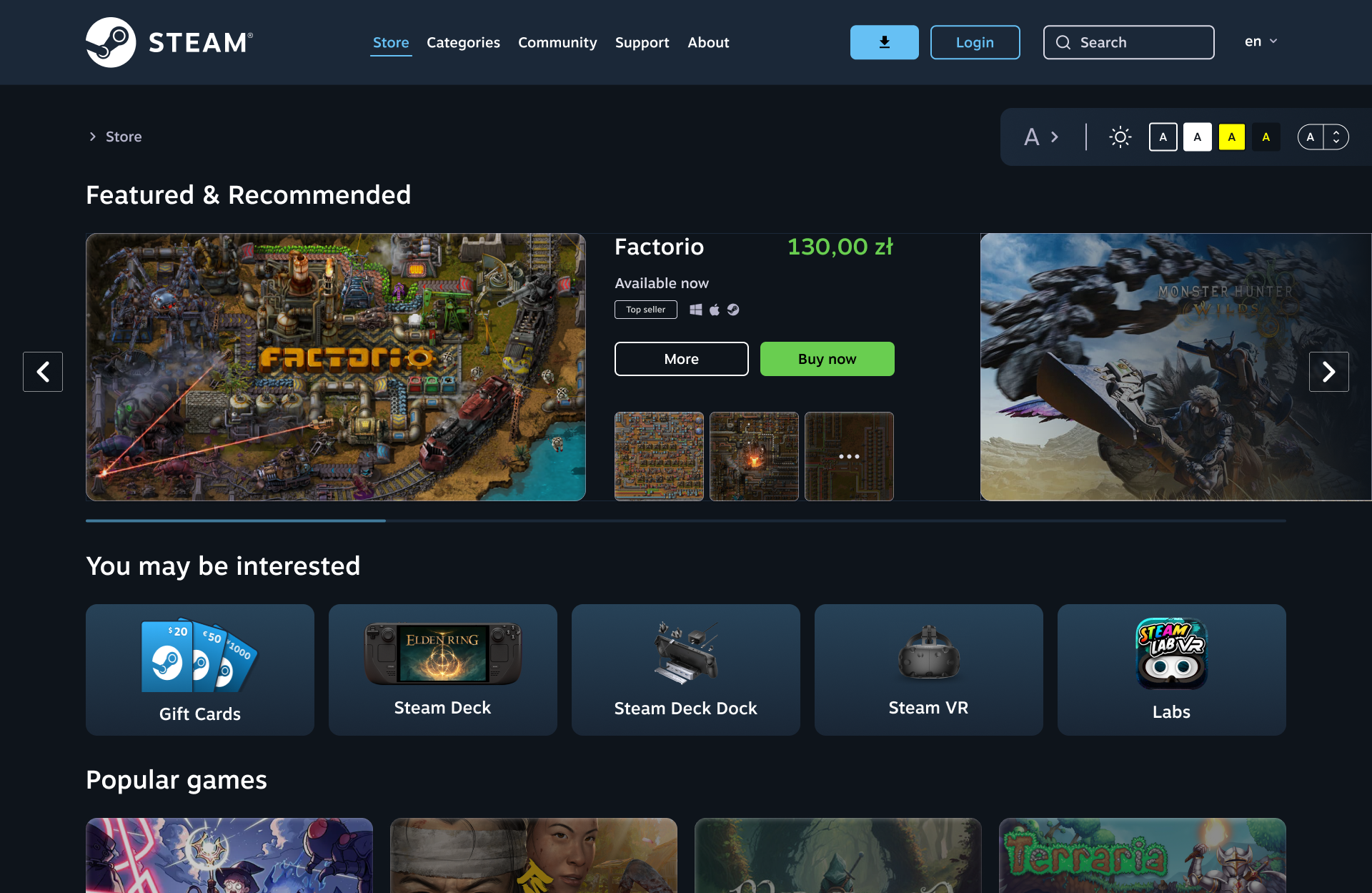

During the analysis phase of the existing Steam interface, I thoroughly examined five key views of the service to identify strengths and areas for improvement in terms of usability, accessibility, and intuitiveness
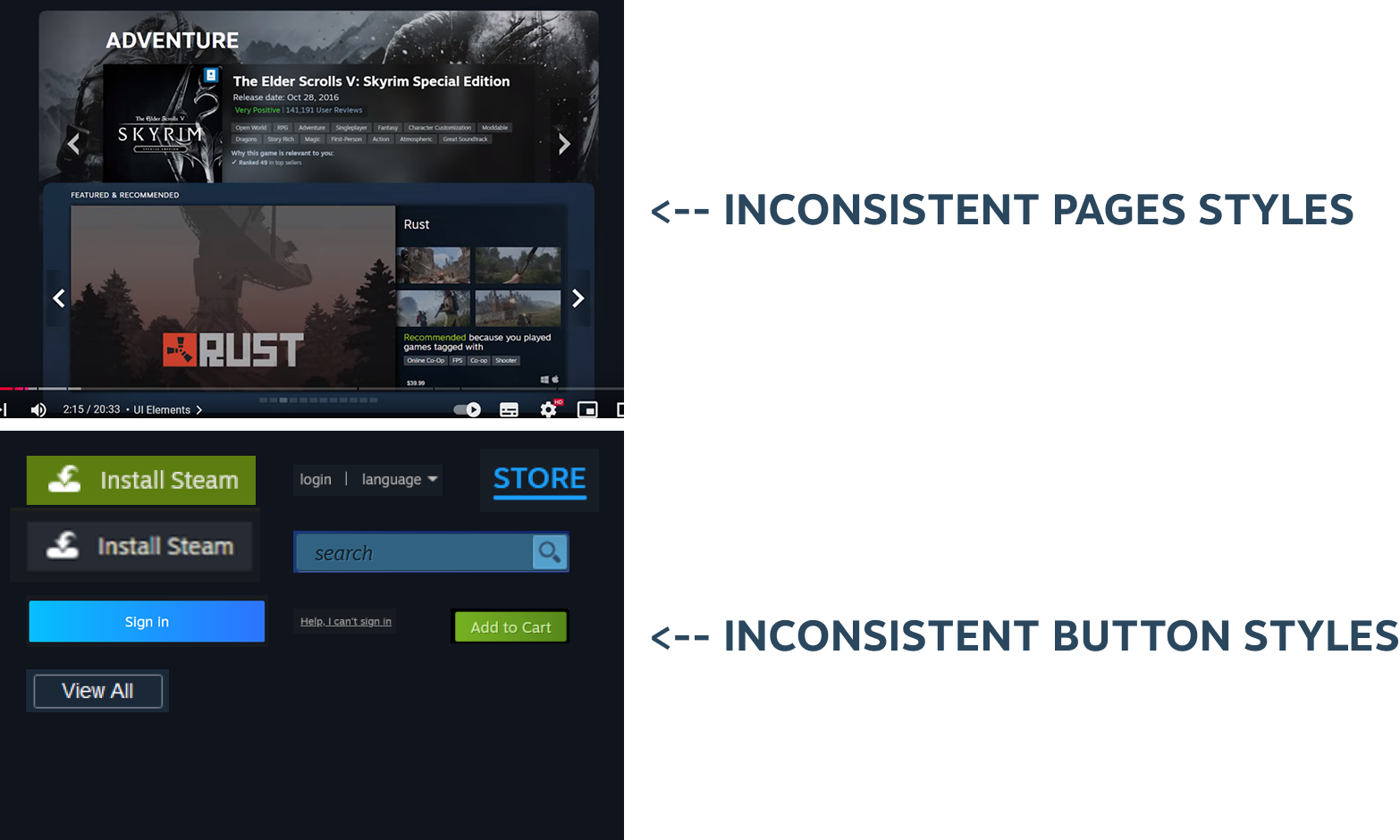
The analysis clearly identified areas for improvement and formed the basis for a redesign in line with universal design principles.

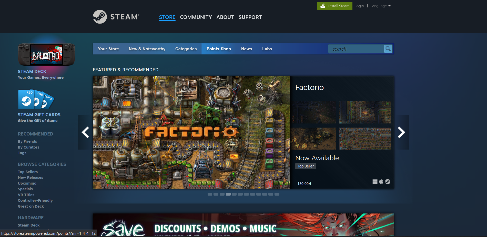
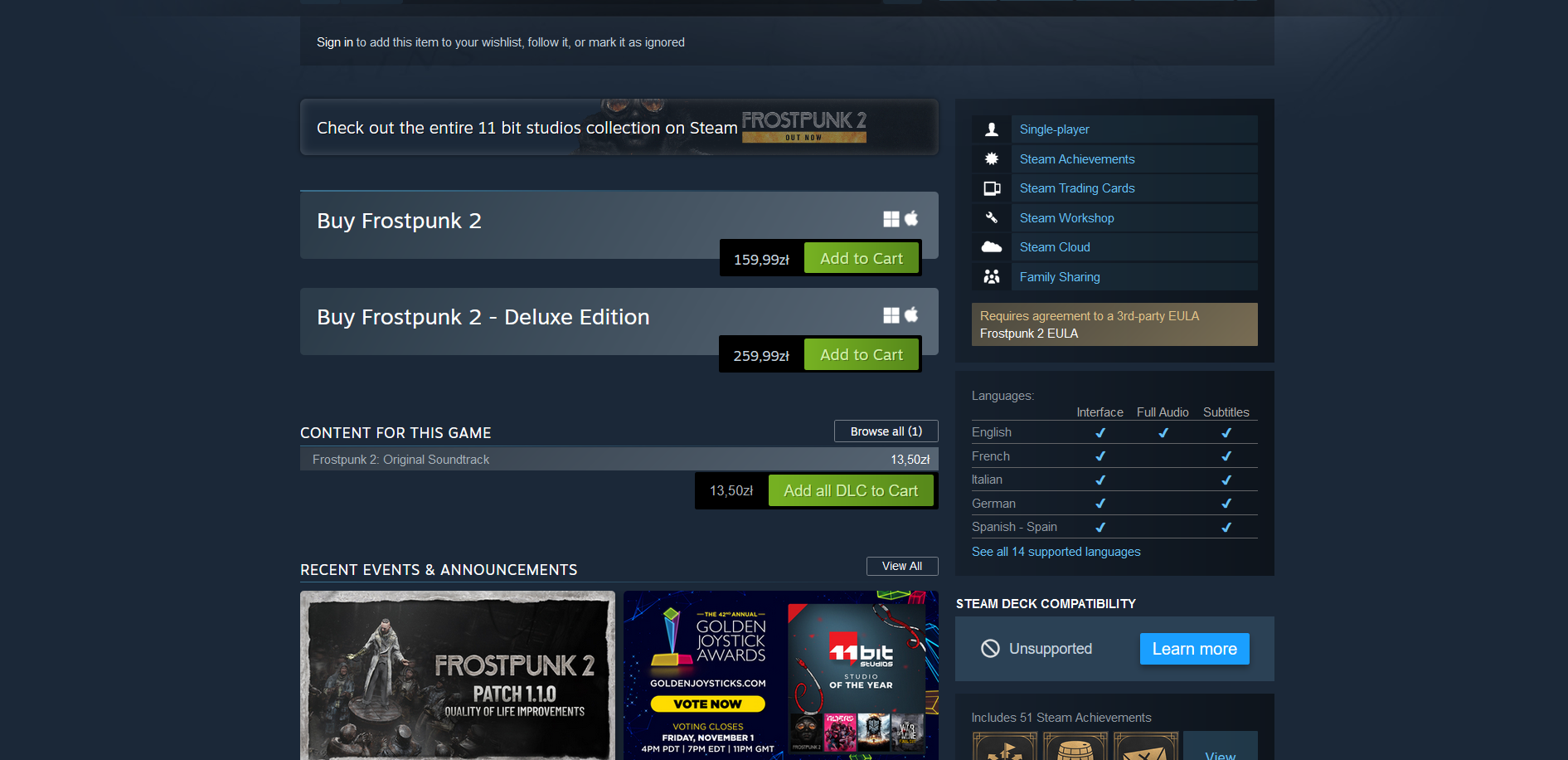
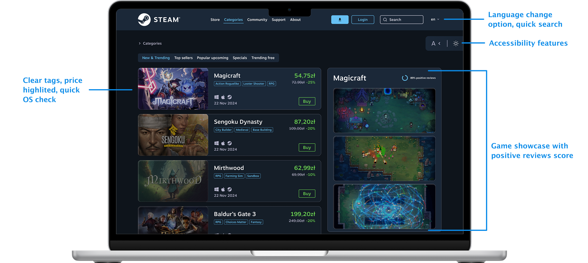
As part of the redesign, a number of improvements have been made to increase the accessibility, readability, and intuitiveness of the Steam interface (top - existing one, bottom - redesigned):
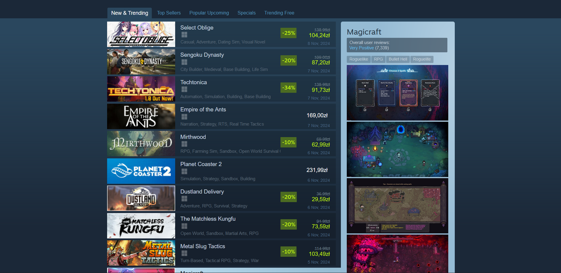
Home page – contrast has been improved and button styles have been standardized, breadcrumbs and accessibility tools have been added, navigation has been optimized, and prices and elements encouraging further scrolling have been highlighted.
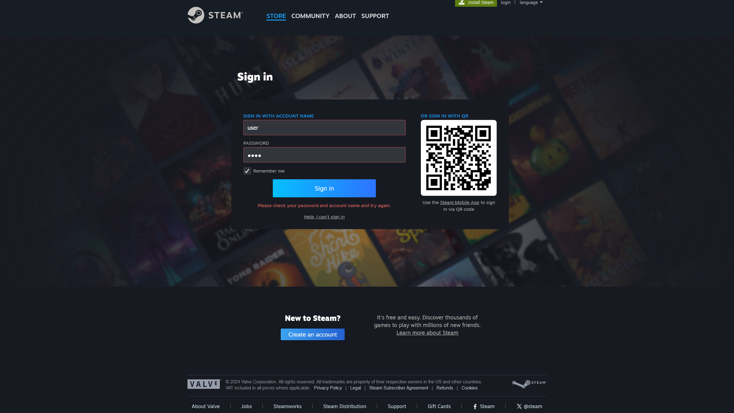
Login page – contrast increased, breadcrumbs added, error messages directly next to form fields improved, registration button moved to a more intuitive location, and access to the “forgot password” function made easier.

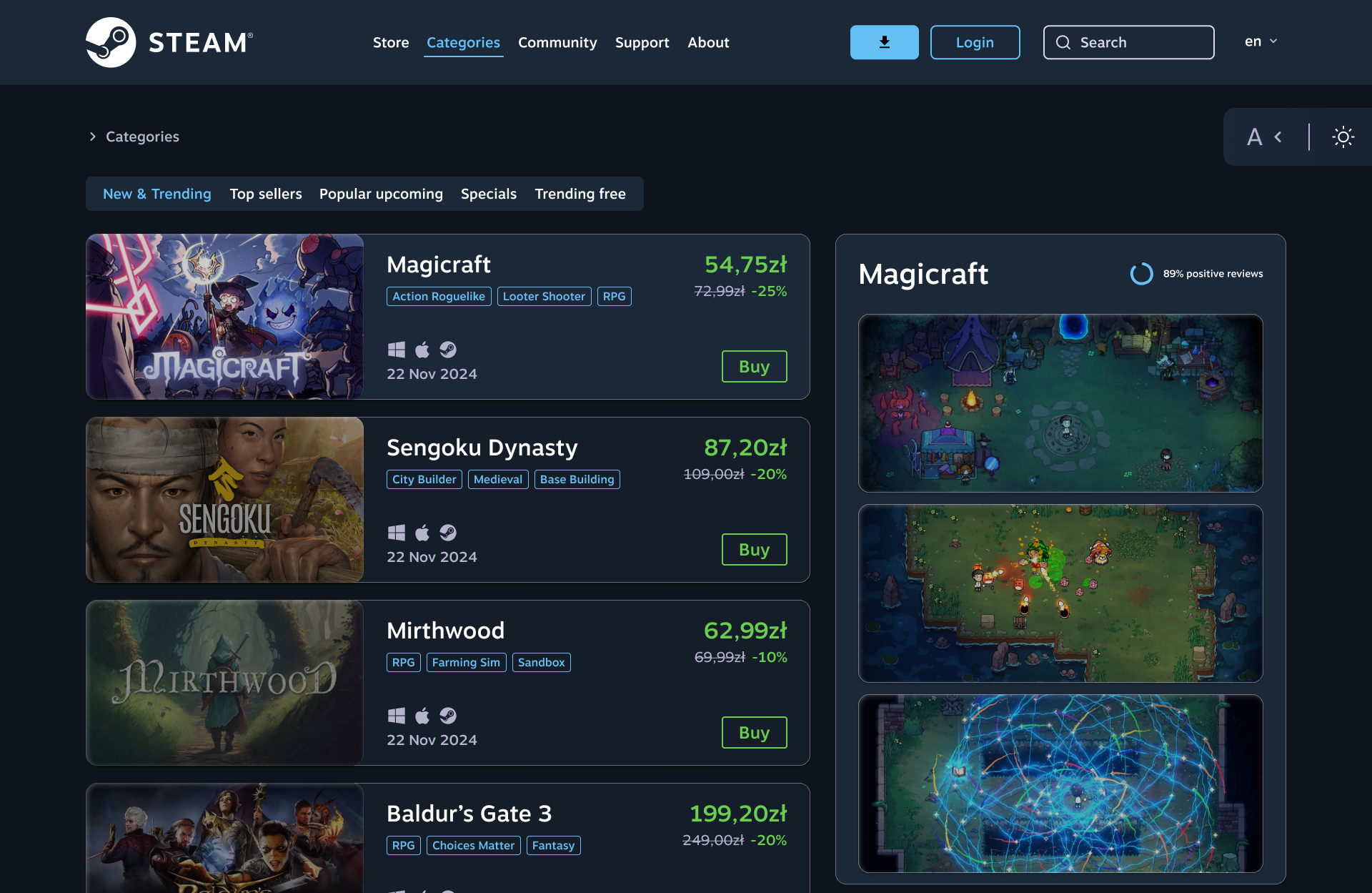
Game list – contrast, information architecture, and breadcrumbs have been improved, prices have been highlighted, user ratings are now displayed as percentages, and a button for quickly adding a game to the cart has been added.
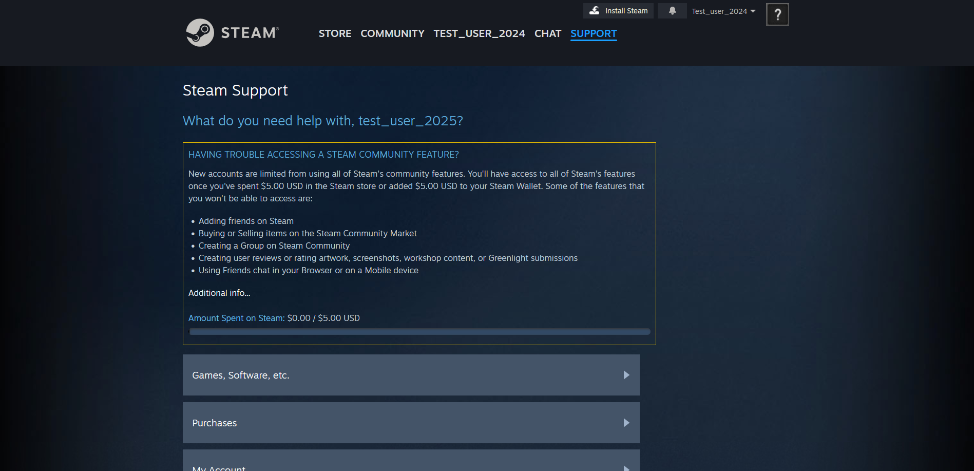
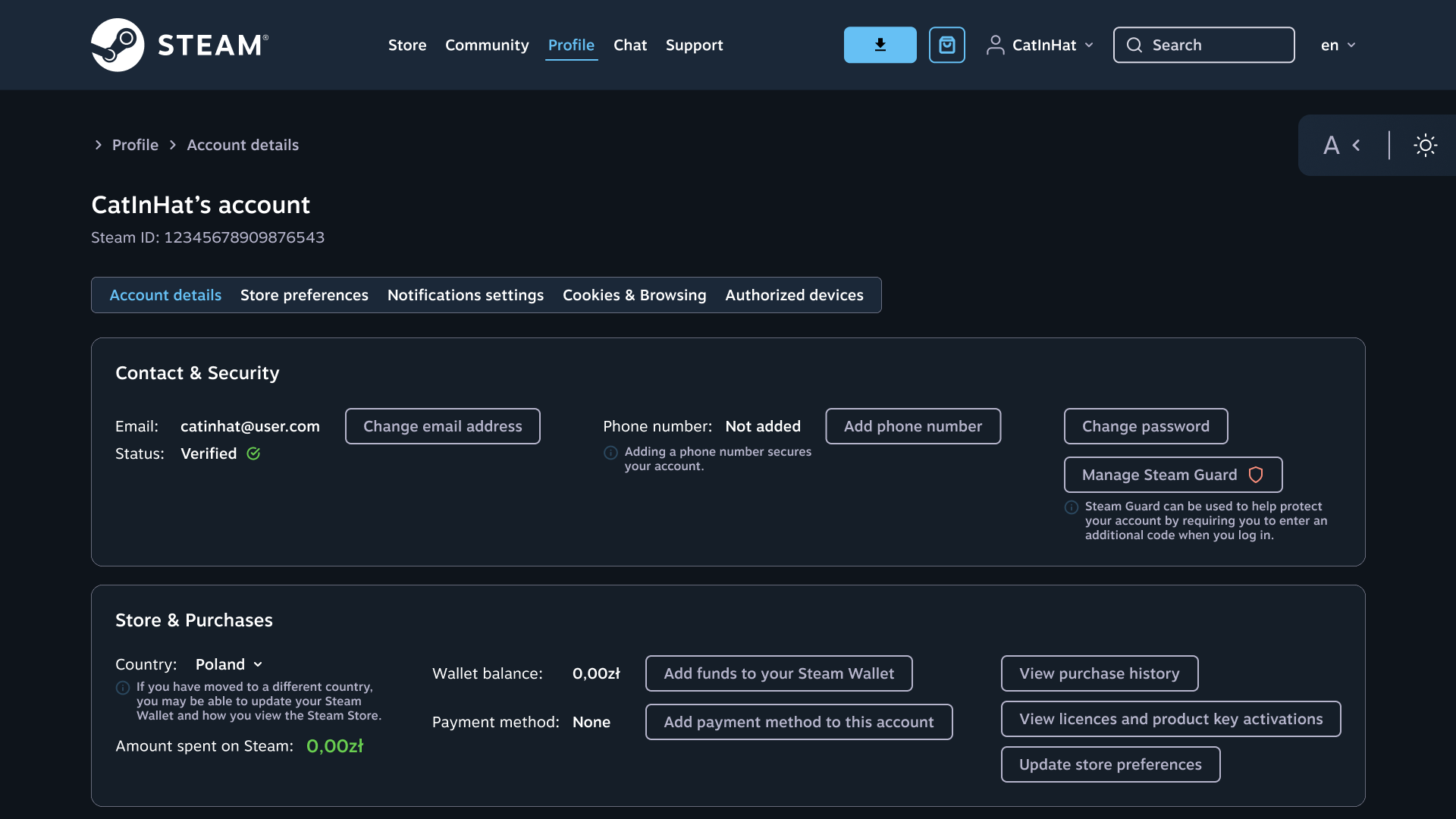
User account – moved spending information to a logical location, added tooltips explaining the data.
Game details – improved contrast and breadcrumbs, highlighted the price, moved the most important information higher up, retained the orderly tabular structure, and clearly marked add-ons and game types.
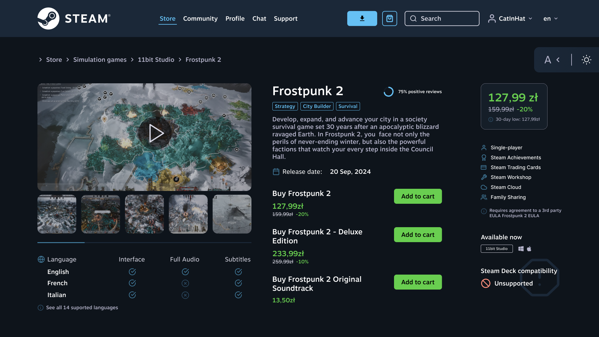

From top left to bottom right
This first version felt like it was missing something in the middle-bottom area, but I did like how the details, languages, and buying section were grouped together. I imagined this grouping would make navigation fairly clear, though the underused space could have created some imbalance and might not have guided attention as effectively as I wanted.
In this version, the layout ended up feeling too cramped. Placing the positive opinions score so close to the game title didn’t work visually, and the language check icons were too bright, which I realized could draw attention away from more important content. I imagined this layout would make the page harder to scan quickly, and the visual distractions could slow users down when focusing on the buying section.
Here I experimented with the right-column layout and reduced the contrast of the language check icons. Lowering the contrast would have made them less distracting, which was a step forward, but the alternative column layout disrupted the natural scanning flow. I imagined this would make it harder for users to find key information compared to the earlier setup.
In the last iteration, I moved most of the information into the middle column and shifted the languages to the left, which opened up more room for the buying section. I also kept the original right column with price and additional info, since it supported a clearer path for scanning. This version felt more balanced overall, and I imagined it would give users a cleaner structure where the buying options stood out more clearly, making the task of finding them easier and more intuitive.
I won't show numeric data obtained, but focus on min results and conclusions:
The analysis showed that the improved version of the interface increases the intuitiveness and efficiency of using the website, which is confirmed by both higher SUS scores and eye-tracking results. Users found relevant elements faster in tasks requiring selective attention (e.g., soundtrack price), and the number of fixations and saccades indicates a more transparent content layout. In the case of well-exposed elements (e.g., the search field on the home page), the original version was equally or more effective. Overall, the changes improved the usability of the interface, minimizing the cognitive effort of users while maintaining a high level of satisfaction.
A heat map shows areas of gaze fixations ("stops") on a screen across all tested users, visualizing attention intensity with colors - green for fewer fixations and red for more.
As an example, I will show a comparison of the resulting heat maps for the game details page: the top is the existing interface, and the bottom is my redesign. The task users tested on eyetracker was simple: find the price of shown game's soundtrack.
.jpg)
.jpg)
Looking at the original version, you can see that users had to scan through more areas before finding the price. Their attention is scattered across different sections (yellow to red areas). In the redesigned version, the shopping section is clearer and more logically grouped, so people only search a smaller area.
This makes the redesigned version perform better - it helps users find the soundtrack price more quickly and with less effort. That said, it’s not perfect. You can still spot smaller green areas on icons, which shows some distraction. Highlighting too many elements can draw attention away from the main task, so there’s still room for improvement.
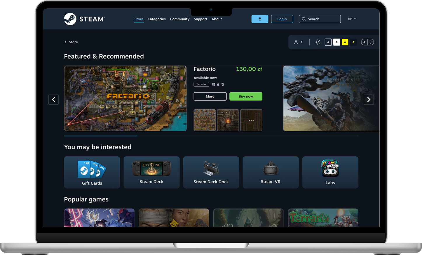

The analysis showed that the original Steam interface had numerous accessibility issues, such as low contrast, lack of alternative text, and errors in forms. The redesign effectively eliminated these shortcomings by improving contrast, organization of elements, and intuitiveness of the interface. The average SUS (System Usability Scale) score increased from 80 to 84.25, and eye tracking showed faster identification of key elements and better clarity in views 3–5, although the differences were not statistically significant.
The introduction of universal design principles significantly improved WCAG compliance and the subjective user experience, making the interface more user-friendly and intuitive. However, these changes did not fully translate into objective usability metrics, suggesting a need for further optimization and testing.
